Difference between revisions of "Talk:Jukebox Software"
Spacefractal (talk | contribs) (→Grid suggestions) |
(Thus far) |
||
| Line 314: | Line 314: | ||
--[[User:Spacefractal|Spacefractal]] 10:05, 15 March 2006 (EST) | --[[User:Spacefractal|Spacefractal]] 10:05, 15 March 2006 (EST) | ||
| + | |||
| + | == Thus far == | ||
| + | |||
| + | Sorry, I don't know how to "quote" someone, so I italicized in bold the items I'm replying to. Don't wanna confuse others' comments with mine. | ||
| + | |||
| + | |||
| + | '''''I limited the columns to items that I though would be the first selection criteria, a grid makes comparing the software so much easier. Some space eating items are replaced by icons. I do support the template for the form, but I suggest to give each software it's own page. This has two reasons: 1) it reduces the jukebox page size a lot making it more readable. 2) it allows to make detailed pages for each piece of software with specs and perhaps hint and tips. So the form template is a good thing, so each Jukebox page has at least the same items filled in, my suggestion is to make the jukebox (and emulators) page an general overview for quick comparison and easy access to the individual software pages.''''' | ||
| + | |||
| + | |||
| + | |||
| + | I like this theory to allow basic sorting, then link from the grid to further description. I think the thumbnails are better placed on the individual page, since they take a lot of room on the grid and may not offer any help since the size by its very nature would have to be even SMALLER than a normal thumbnail to keep the grid small. A good example is SpaceFractal's thumbnail. It loses all sorts of context at such a compressed size - even though they can be enlarged, putting it on the description pages allow a better view of it when you're examining the software further (such as below - good size for the thumbnail on the description page as well, kudos!) | ||
| + | |||
| + | I also like SpaceFractal's suggestion as a format idea for the description page as well, although list the general items on the side of the thumbnail, and move the description to the bottom to fill out the page, like so: | ||
| + | |||
| + | |||
| + | '''Example of individual description page''' | ||
| + | |||
| + | --- Arcade Music Box 2 --- | ||
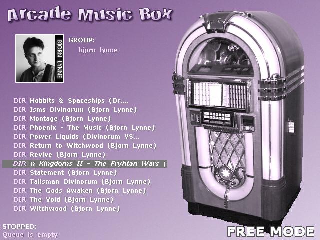
| + | [[Image:Arcade_Music_Box.jpg|thumb|Picture of Arcade Music Box|320px|right]] | ||
| + | * '''OS:''' Windows 98 and above. | ||
| + | * '''Cost:''' Freeware with donations link. | ||
| + | * '''Style:''' Interface look like a htpc application (Access Albums, Singles, Videos and Karaoke from a menu). | ||
| + | * '''Resolution:''' Best under 320x240 or 640x480 by default | ||
| + | * '''Skinnable:''' (this is just for example of partial) Partial. Selectable font and text color. | ||
| + | * '''Monitor:''' Support Horizontal, Vertical (both software and hardware) and Dual Montitor. | ||
| + | same). | ||
| + | * '''Controller:''' Toucescreen, Keybard, Joysticks (include 49way) and Trackball support. | ||
| + | * '''Special:''' Have a nice "Name That Song" game. Few buttons is required. | ||
| + | * '''Homepage:''' http://www.arcademusicbox.com | ||
| + | |||
| + | * '''Destription:''' This jukebox software was designed for use in cabinets running MAMEWah ...... blah blah blabety blabety blah more filler here if needed or taken directly from the homepage and blabety blah | ||
| + | |||
| + | <br> | ||
| + | |||
| + | |||
| + | ''''' "Skinnable" covers a lot of ground.....Do we waant to break this out further by skinnability features (change font, change element size/location, change element look, change background, etc.) or perhaps just designate skinnability as "partial" (change only some things like background), "basic" (change the complete look but not change element sizes or locations), and "full" (change everything inclusing sizes and locations)? ''''' | ||
| + | |||
| + | This is what I was thinking earlier but did a terrible job of explaining this, thanks Chris! I like the idea of partial, basic, and full, with further enhancement of the description of what those terms mean specific to the software being done on the individually linked software page - see above for what I'm thinking of | ||
| + | |||
| + | |||
| + | Lastly, as SpaceFractal pointed out, controls are NOT the same. I don't recall where, but in comparison of two different programs, one was able to utilize the arcade controls of whatever type as input items, while the other required a keyboard for something and wasn't written to allow doing away with the keyboard even if you wanted to do so. | ||
Revision as of 10:47, 15 March 2006
A template should be created for this page, or at least a standardized format for laying out the features of each software.
For example:
- One description lays out resolution, others don't
- One lays out orientation, others don't.
- One lays out skinning, others don't.
- One lays out OS it runs on, others don't.
- One doesn't say if it's freeware, while others do.
The reason I say this is because this is the exact same thing as going to each web page and fumbling through them to figure stuff out.
Also, just as with the emulators, this needs to be fleshed out more fully, such as the listing in the juke forum. An example is the emulators listings. Motch laid out a fistful of them so we could go back in and know what might be out there and flesh out those (or delete them if obsolete) later, rather than piecemeal them in one by one.
Lastly, while I know these may be freeware and you guys may want to point out the presence of a donation link, in the software description does not seem to be the place to do so (to me anyway). Mention it in the overview/summary at the top. Mentioning it up there, and then including a link within the description of each looks far cleaner. Donations aren't a "feature" of the software, although I CLEARLY understand they're greatly appreciated.
Drewkaree 09:01, 14 March 2006 (EST)
Contents
Template/Standardization points
Here is a small list of things I've noticed in looking through this small collection listed so far. More points obviously can/would be needed but here's a start on what I'm talking about.
- OS this runs on
- Freeware, shareware, or commercial (along with cost)
- Touchscreen compatible
- Media format(s) supported (mp3, Ogg, Ape, FLAC, etc)
- Skinnable (and are they preset, or end-user can create?)
- Additional requirements? (.NET Framework, specific version of WMP, any runtimes or .dll's, etc)
- Supported resolutions (or at least a range)
- Album-oriented, singles-oriented, or both
- Monitor orientations supported
- ?
Obviously I don't think I've covered everything, but setting this up and being consistent will clearly make this easier for folks to sift through the info based on their needs and may introduce them to something they never even thought of that they might like to have.
- Maybe a feature grid would help on the Jukebox/Emulation software pages? The header column could link to pages and have each jukebox/emulator their own page.
Jukebox OS Type Touchscreen Supported media SoftwareX Windows XP Shareware Yes MP3, OGG SoftwareY Win98, Win2000, WinXP Freeware No MP3
- Felsir 09:40, 14 March 2006 (EST)
The Standardization Point....
Im look on that, when I have time later on this week. I'm should start one place, and I was thinking about this (but diddent have the time).
Here is a sample table (using my own software), do Im missing something? (it would been greatly if a smaller font can been used)
SOFTWARE OS Type Skinnable Additional Style Monitor Media Resoulutions Controllers Speciel Arcade Music Box 2 Windows Freeware
DonationYes None Singles
AlbumsHorizontal
Vertical1) BASS
2) Videos
2) Netradio320x240, 640x480
ArcadeVGA
Dual ScreenTouchscreen
Keys/Joys
TrackballName that song
CDG integrated
HTPC interface
1) BASS sound system support: MP3, OGG, WAV, FLAC, MOD, XM and lots more
2) require Microsoft Media Player
--Spacefractal 17:45, 14 March 2006 (EST)
The grid is an AWESOME idea! I was thinking the same thing about the emulators pages, but I figured start small with something like this page and see what ideas were brought forth.
Perhaps to save space, have the features be listed as numbers and have a list of what the numbers correspond to below it? I've noticed looking at the second table, it extends beyond the screen. I'm certain there's a way to limit the width of the table, but how to fit everything in it then?
Thanks for the idea Felsir!
Drewkaree 18:32, 14 March 2006 (EST)
maybe switch Horizontal and Vertical (but this form is a MUCH harder to swich. Maybe we could table like this, and use a standaized destripction to the software itself?
Meybe you are right, using numbers instead, but would it not to have to many numbers? The width is a high problem with the large font. Using a small verdana font would help a lots.
--Spacefractal 18:38, 14 March 2006 (EST)
Perhaps it's a solution that has too many items needed to implement it properly.
Something else I'm wondering is perhaps a bullet-point list standardized so info just has to be plugged in as an = X feature thing.
Ex:
- OS = DOS, 98
- Cost = Commercial software ($35)
- Resolution = 800x600 for best results
and so forth. Maybe a small template to include the bullets, features list, and = sign could all be standardized and adding a new software could call up a "fill in the blanks" type of template.
I don't even know if that type of template is possible, so I could be talking out of my ass :)
Drewkaree 18:58, 14 March 2006 (EST)
Maybe this form:
Arcade Music Box 2
- OS: Windows 98 and above.
- Cost: Freeware with donations link.
- Destription: This jukebox software was designed for using in MAME cabinets running MAMEWah (Interface is very the
- Style: Interface look like a htpc application (Access Albums, Singles, Videos and Karaoke from a menu).
- Resolution: Best under 320x240 or 640x480 by default (skinable).
- Monitor: Support Horizontal, Vertical (both software and hardware) and Dual Montitor.
same).
- Controller: Toucescreen, Keybard, Joysticks (include 49way) and Trackball support.
- Special: Have a nice "Name That Song" game. Few buttons is required.
- Homepage: http://www.arcademusicbox.com
This form is easy to edit and have a lots better destriptions (and the screenshots say very much, whay they does). What do you mean? Much better to the large table and get a lots more information about a jukebox software.
--Spacefractal 01:25, 15 March 2006 (EST)
Grid suggestions
How about this:
| SOFTWARE | OS | Type | Skinnable | Monitor | Media | Resolutions | Cab friendly | Special |
| Arcade Music Box 2 | Freeware Donation |
Yes | BASS1 Videos2 Netradio2 |
320x240, 640x480 ArcadeVGA Dual Screen |
Yes | Name that song CDG integrated HTPC interface | ||
| Doscab, Wincab | Freeware Donation |
Yes | MP3, OGG | Any3 | Yes | Supports coin inserts |
1) BASS sound system support: MP3, OGG, WAV, FLAC, MOD, XM and lots more
2) require Microsoft Media Player.
3) resolutions only limited by used videocard.
I limited the columns to items that I though would be the first selection criteria, a grid makes comparing the software so much easier. Some space eating items are replaced by icons. I do support the template for the form, but I suggest to give each software it's own page. This has two reasons: 1) it reduces the jukebox page size a lot making it more readable. 2) it allows to make detailed pages for each piece of software with specs and perhaps hint and tips. So the form template is a good thing, so each Jukebox page has at least the same items filled in, my suggestion is to make the jukebox (and emulators) page an general overview for quick comparison and easy access to the individual software pages. Felsir 03:38, 15 March 2006 (EST)
(Spacefractal's version)
| SOFTWARE | OS | Type | Skinnable | Monitor | Media | Best Resolution | Controllers | Screenshot |
| Arcade Music Box 2 | Freeware Donation |
Yes3 | BASS1 Videos2 Netradio2 |
320x240 to 640x480 Dual Screen |
Arcade Controls Keypad Controls |

| ||
| Doscab, Wincab | Freeware Donation |
Yes3 | MP3, OGG | 640x480 and above |
Arcade Controls Touchscreen |

|
1) BASS sound system support: MP3, OGG, WAV, FLAC, MOD, XM and lots more
2) require Microsoft Media Player.
3) resolutions only limited by used videocard.
Maybe the changed table on the main page, and a link to a each own page to a better destription (made by the author, or found from the homepage?
All software are allready cabfriedly, so this could instead go for the controller instea (using icons?). And the speciels could been a screenshots? Features is allready destription on the own wikipage allready.
Nb. Sorry for the many edit (did not showed a preview).
--Spacefractal 09:00, 15 March 2006 (EST)
Please do not edit someone else's message. This disrupts communication and makes it hard for
someone to react on something that is said before. In this case, copy the table so others
can see what the texts refers to. Note that this is not criticism on your contribution to the
 topic (which is welcomed)!
"Skinnable" covers a lot of ground, from simply changing a color or background image to being able to change the size and location (or even existence) of elements. Do we waant to break this out further by skinnability features (change font, change element size/location, change element look, change background, etc.) or perhaps just designate skinnability as "partial" (change only some things like background), "basic" (change the complete look but not change element sizes or locations), and "full" (change everything inclusing sizes and locations)?
--Chris 09:21, 15 March 2006 (EST)
Maybe we can make the skinnable column to "No", "Yes-", "Yes+","Yes++" and add in the notes that "no" means no options,"Yes-" means limited to font and colours, "Yes+" means replaceable images and "Yes++" means replacement of images and interface elements? Also if all jukeboxes are cab friendly, the column can be removed. What info does controller options add? If they can be controlled by cabinet that means keypresses? Mouse, trackball, touchscreen aren't those also the same things? I mean: mouse and trackball are the same and as far as I know is a touchscreen driver similar to a mouseclick on a specific location - similar to a drawingtablet being the same as mouse input? So that column doesn't really add anything? Felsir 09:44, 15 March 2006 (EST)
Sorry I changed the table. I got deleted it, wich I should not. Bear over with me.
| SOFTWARE | OS | Type | Skinnable4 | Monitor | Media | Best Resolution | Controllers | Screenshot |
| Arcade Music Box 2 | Freeware Donation |
Yes Full3 |
BASS1 Videos2 Netradio2 |
320x240 640x480 |
Arcade Ctrl Touchscreen |

| ||
| Doscab, Wincab | Freeware Donation |
Yes Full3 |
MP3, OGG | 640x480 and above |
Arcade Ctrl Keypad Ctrl |

|
1) BASS sound system support: MP3, OGG, WAV, FLAC, MOD, XM and lots more
2) require Microsoft Media Player (normally version 7+).
3) resolutions can also been changed by the skin, and is only limit by used videocard.
4) How can the software been skinned?
Partial: change only some things like background.
Basic: change the complete look but not change element sizes or locations
Full: change everything including sizes and locations (but not resoulution)
Mouse, trackball, touchscreen is NOT the same. It depend you can see the mousepointer or not, or how the trackball was used (traclball can been used as a analog joystick, like Arcade Music Box does). This is why users can se it controlled by a "Touchscreen", "Arcade Controller" or by "Keypad controller". Mouse CAN been coved by both Arcade controller and touchscreen.
--Spacefractal 10:05, 15 March 2006 (EST)
Thus far
Sorry, I don't know how to "quote" someone, so I italicized in bold the items I'm replying to. Don't wanna confuse others' comments with mine.
I limited the columns to items that I though would be the first selection criteria, a grid makes comparing the software so much easier. Some space eating items are replaced by icons. I do support the template for the form, but I suggest to give each software it's own page. This has two reasons: 1) it reduces the jukebox page size a lot making it more readable. 2) it allows to make detailed pages for each piece of software with specs and perhaps hint and tips. So the form template is a good thing, so each Jukebox page has at least the same items filled in, my suggestion is to make the jukebox (and emulators) page an general overview for quick comparison and easy access to the individual software pages.
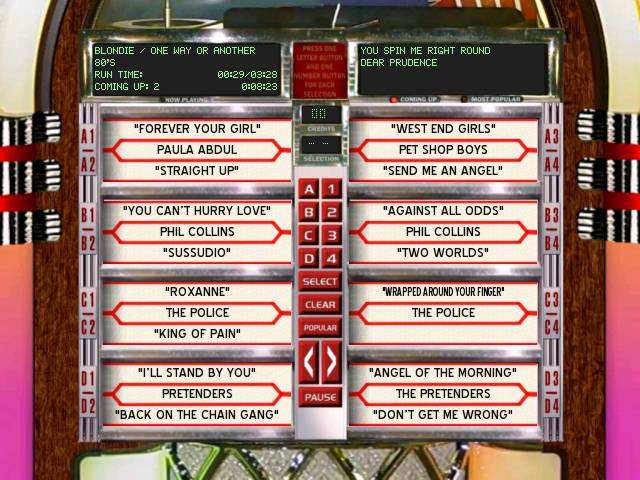
I like this theory to allow basic sorting, then link from the grid to further description. I think the thumbnails are better placed on the individual page, since they take a lot of room on the grid and may not offer any help since the size by its very nature would have to be even SMALLER than a normal thumbnail to keep the grid small. A good example is SpaceFractal's thumbnail. It loses all sorts of context at such a compressed size - even though they can be enlarged, putting it on the description pages allow a better view of it when you're examining the software further (such as below - good size for the thumbnail on the description page as well, kudos!)
I also like SpaceFractal's suggestion as a format idea for the description page as well, although list the general items on the side of the thumbnail, and move the description to the bottom to fill out the page, like so:
Example of individual description page
--- Arcade Music Box 2 ---
- OS: Windows 98 and above.
- Cost: Freeware with donations link.
- Style: Interface look like a htpc application (Access Albums, Singles, Videos and Karaoke from a menu).
- Resolution: Best under 320x240 or 640x480 by default
- Skinnable: (this is just for example of partial) Partial. Selectable font and text color.
- Monitor: Support Horizontal, Vertical (both software and hardware) and Dual Montitor.
same).
- Controller: Toucescreen, Keybard, Joysticks (include 49way) and Trackball support.
- Special: Have a nice "Name That Song" game. Few buttons is required.
- Homepage: http://www.arcademusicbox.com
- Destription: This jukebox software was designed for use in cabinets running MAMEWah ...... blah blah blabety blabety blah more filler here if needed or taken directly from the homepage and blabety blah
"Skinnable" covers a lot of ground.....Do we waant to break this out further by skinnability features (change font, change element size/location, change element look, change background, etc.) or perhaps just designate skinnability as "partial" (change only some things like background), "basic" (change the complete look but not change element sizes or locations), and "full" (change everything inclusing sizes and locations)?
This is what I was thinking earlier but did a terrible job of explaining this, thanks Chris! I like the idea of partial, basic, and full, with further enhancement of the description of what those terms mean specific to the software being done on the individually linked software page - see above for what I'm thinking of
Lastly, as SpaceFractal pointed out, controls are NOT the same. I don't recall where, but in comparison of two different programs, one was able to utilize the arcade controls of whatever type as input items, while the other required a keyboard for something and wasn't written to allow doing away with the keyboard even if you wanted to do so.
